When I tell people that I’m a graphic designer, I’m often asked: “What does that mean? What do you actually do?”
When I tell them I help entrepreneurs create and maintain visual brand consistency for their businesses, I get even more confused looks (this includes my mother).
Consistent visual branding is the way companies create a unique look, feel and mood for their customers every time they engage with the brand.
Maybe this example will help: I recently experienced consistent visual branding with the online retailer Mod Cloth.
First I was lured in by the company’s online ad. Its visuals pulled me and I clicked their link. I loved the look and feel of the website, which visually matched the ad that had led me there.
The website felt friendly, with a handmade/vintage vibe. Before I knew it, I had added several items to my shopping cart. I had to force myself to whittle my selections down to one dress before completing my purchase.
Soon after I paid for my purchase, I received an email confirmation. This e-receipt also matched the look and feel of the initial ad and website (right down to the illustrated pug that thanked me with a speech bubble down by my total).
But the visual consistency didn’t stop there.

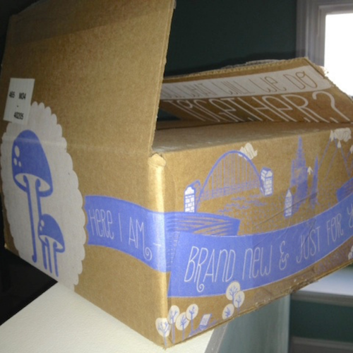
A few days later, this box landed on my doorstep.
Even the graphics on their shipping box matched what I had already grown accustomed to. The company transferred what began as an electronic experience into a real-world one with consistent branding.
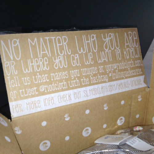
Check out the inside of the box.

They could have easily skipped the expense of double-sided printing, and they could have used one color instead of two. But, those choices weren’t in line with the branding they established with me in the first place. Even the clever copywriting carried the “friendly” vibe I’d come to expect.
At every point of contact, I was met with the same messages, both visually and verbally. That’s brand consistency.
Brand consistency is often easier to see with the big guys (for example, consider Apple, Coca-Cola, or Qdoba). Most times, customers aren’t necessarily aware of brand consistency while they experience it. Yet, a part of them expects it. And if it’s NOT there, you can bet, they will notice.
Remember, the size of your business is irrelevant. What matters is consistency in how you engage with your customers.
Take note: Your logo alone does not define your visual brand. Branding also includes your color palette, typeface and the personality of your posts. All points of contact, from your business card to your website, should match and communicate your brand’s core messages.
So, where can you begin to create a consistent brand? Consider all the places your customers experience your company. This includes emails, downloads, receipts, websites, and newsletters.
You have a brief time to engage your customers. What do you want them to feel when they experience your brand?
I believe the best way to build brand consistency is to establish ongoing partnerships with designers, copywriters, and photographers who can help you build and maintain the message you want your brand to convey.
What are your favorite online spaces? Where do you like to shop, based on how the brand makes you feel? Share your top picks in the comments below.
I’m always looking for stellar examples of brand consistency.


